Kirk Goldsberry is one of the most popular figures in the basketball analytics world. He is known mainly for the use of shot charts in his analyses. Here there is an example with all the shots Lebron James has taken in his career:
Happy Birthday, LeBron
— Kirk Goldsberry (@kirkgoldsberry) December 30, 2018
His constellation so far... pic.twitter.com/4HuCjTgl4x
Shot charts can be useful for, say, identifying tenedencies on offense of a given player/team, showing what spots on the court a player is most effective at, or analyzing what type of shots a team allows its opponents.
The league that I play in, called LEB Oro, provides shot charts in its platform, Baloncesto en Vivo. For this blog post, I created an R package called rfeb, that allows us to easily scrape the shot coordinates provided by this website and plot the shot charts of the game or games we want.
Having said that, for some strange reason, the platform Baloncesto en Vivo does not provide any type of selection menu to access games played weeks before (or seasons before). Only the most recent games are visible.
It is possible to access previous games if you know the game id and adding it to the base url (http://baloncestoenvivo.feb.es/Game/). However, it appears as if the data gets erased as time goes by. At the moment of writting this post, only the games played before week 13 of this season are available.
Moreover, the data themselves are a bit shaky. As I have come to find out, several gyms in the league produce shot charts that are obviously wrong.
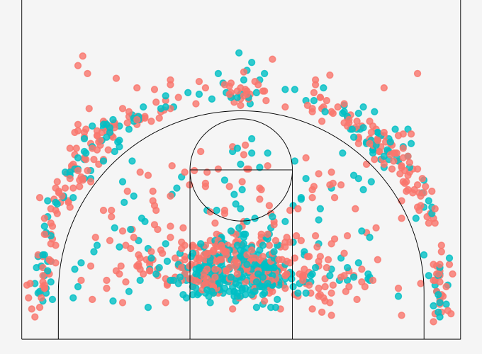
Huesca and Real Canoe are the main suspects. I found several cases but take a look at this game between ZTE Real Canoe and Cerramimbre Valladolid played at the gym of the former. According to the provided shot chart neither one of the two teams shot one shot inside the paint… Until these flagrant errors are eliminated, any analysis done with these data must be taken with a grain of salt.
Shot charts
rfeb is an R package that I created to work with the data available in Baloncesto en Vivo. rfeb contains two main functions at the moment:
extract_shots(): Scrapes the shot data of the specified game idsplot_shotchart(): Plots shot charts with these data
The rfeb package can be installed as follows:
# install.packages("devtools")
devtools::install_github("solmos/rfeb")
You can check out the code of these functions in its Github repository. Note that even though I am going to extract data from my league (LEB Oro), it can also be used to work with the other leagues organized by the Spanish basketball federation (FEB).
So I am going to use rfeb to show how to plot shot charts with the data from the games played throughout the weekend of 01/11/2019.
The ids of these games go from 2010208 to 2010216. I use extract_shots() to scrape the shot data for these 9 games. We get a data frame where each row represents a shot taken, for which the following variables were recorded:
t= Time elapsed since the start of the gamex,y= Shot coordinatesteam= The team for which the player taking the shot playsplayer= Jersey number of the player that took the shotquarter= Quarter in which the shot was takengame= Game idmade= Shot missed (0) or made (1)
library(rfeb)
game_ids <- 2010208:2010216
shots <- extract_shots(game_ids)
head(shots)
## t x y team player quarter game made
## 1 00:39 715.20 833.85 SÁENZ HORECA ARABERRI 3 1 2010208 Missed
## 2 00:47 824.20 245.25 LEYMA CORUÑA 22 1 2010208 Made
## 3 01:23 1069.45 485.05 LEYMA CORUÑA 4 1 2010208 Missed
## 4 01:35 628.00 523.20 SÁENZ HORECA ARABERRI 10 1 2010208 Missed
## 5 01:43 72.10 283.40 SÁENZ HORECA ARABERRI 3 1 2010208 Missed
## 6 01:48 687.95 207.10 LEYMA CORUÑA 1 1 2010208 MadeOnce we have the data, we can use plot_shotcharts(). This function uses ggplot2 to plot the shot chart and it is possible to specify the mapping arguments that we want for the geom_point() geom. For instance, we can color the points according to whether the shot was missed or made.
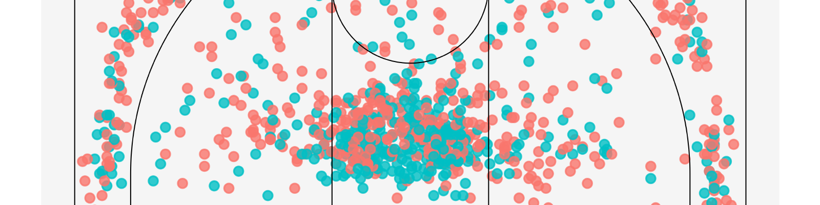
Below I show all the shots taken in these 9 games in one chart:
plot_shotchart(shots, color = made)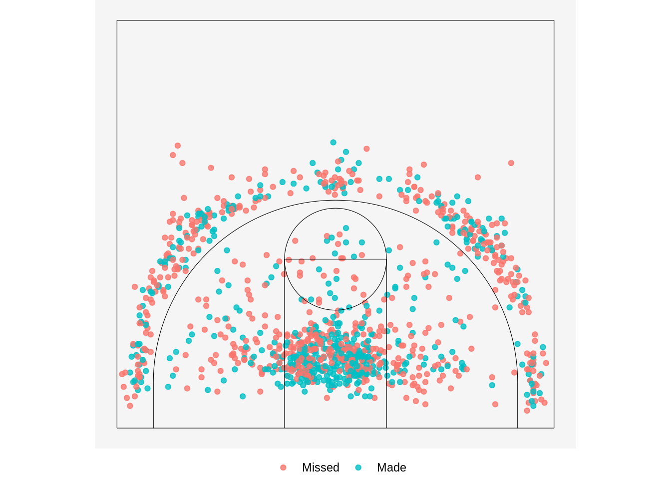
You probably do not want to show all the shots in one chart. It is possible to use other ggplot2 functions to adapt the plot to our needs. We can use, for instance, facet_wrap() to obtain a matrix of shotcharts with the different games:
library(ggplot2)
plot_shotchart(shots, color = made) + facet_wrap(~ game)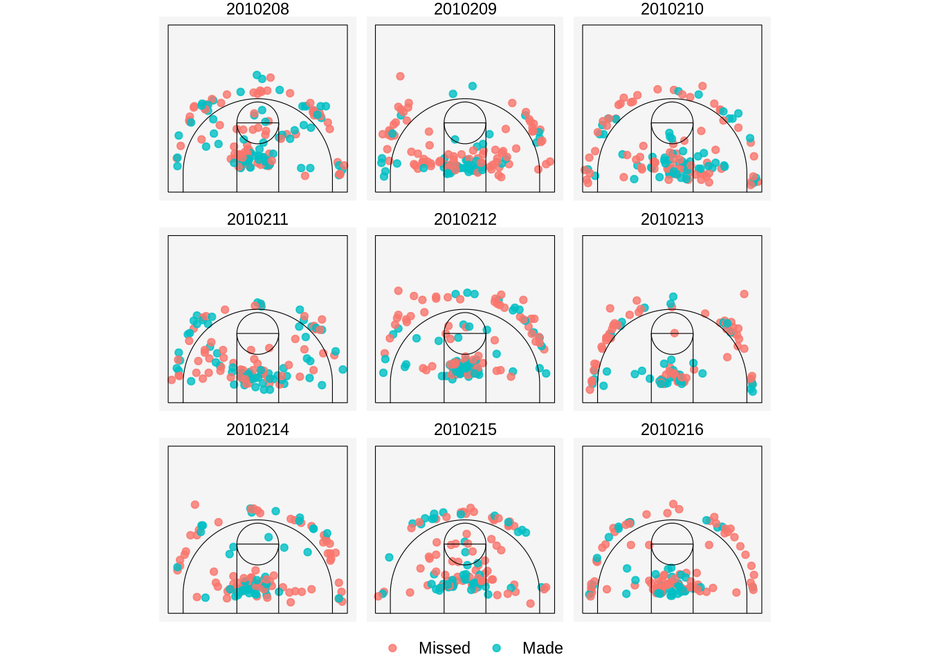
Lastly, I use dplyr to filter the shots that we want to show. Let’s say I want to see the shots I took in the game against Palencia played during the chosen week. The id for this game is 2010215 and I wear number 41:
library(dplyr)
shots %>%
    filter(game == 2010215 & team == "COVIRAN GRANADA" & player == "41") %>%
    plot_shotchart(color = made) +
    ggtitle("Sergio Olmos vs. Palencia")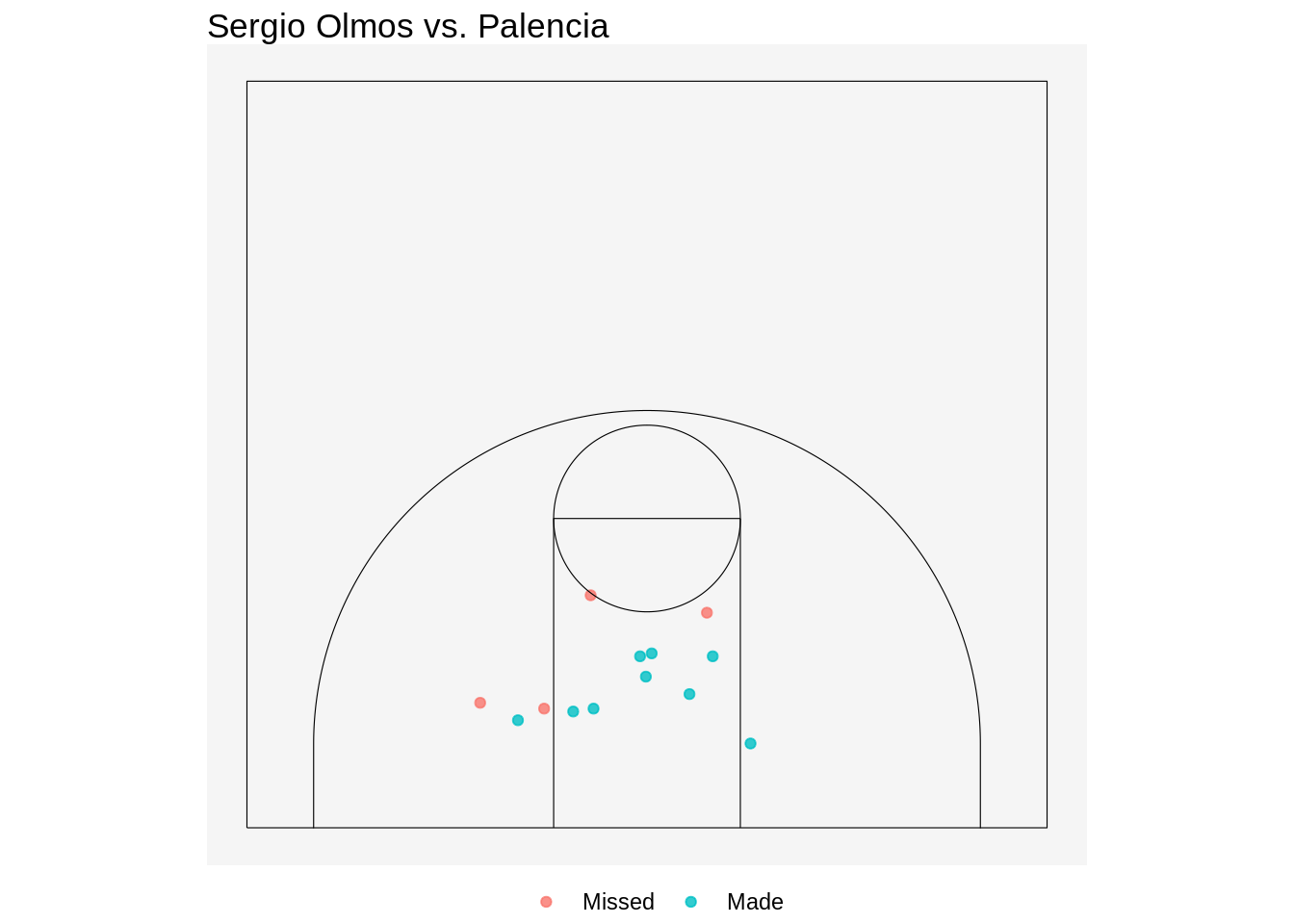
rfeb is still in development. My plan is to add more functionality to it so that not only shot data can be analyzed but regular stats or play-by-play data can be used as well. I will write more posts as I add more functions to the package.